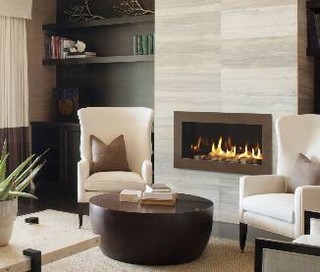
We knew we wanted a linear (read, long and skinny) fireplace. In general, linear fireplaces shouldn't sit on the floor. Ben and I are in "discussions" over how far off the floor it should sit, but we know that the fireplace will be raised similar to this one. Also, we don't want a mantle... although maybe a ledge so Santa can still find our stockings?
We want ambiance, not heat. Our living room is small so 20,000 BTUs should be more than plenty. Hold the logs, please. We'll also pass on those super shimmery pieces of glass that remind me of a (wannabe) cool outdoor bar scene from Miami Beach or Cancun. Just simple black rocks will do.
So putting all of this together, the fireplace decision is made. Drum roll, please: Heat and Glo Cosmo 32 (see picture above). It's sleek, simple and black with a 32" linear shape. And, best of all, it is actually affordable!
The design of the fireplace wall was a bit trickier. After much Houzz-ing (definition: viewing photos on Houzz.com), and much debate, Ben sketched a simple design that we both like:

There is a large window on the left. The fireplace will sit in the middle of the wall, off the floor. There will be a small ledge above the fireplace (maybe just 6" or so), but Ben has reminded me that it is "to give definition to the space" and not for knick-knacks (except during the holidays). The TV will be to the right, set back a bit.
We have decided that we do not want the TV to be the focus of the room. I'd really prefer not to have a TV in the room at all, but let's be honest, I have two kids under 4 years old, so Miss TV is a part-time babysitter (at least while I'm cooking dinner). And I do like to unwind in the evenings with some Jeffrey Lewis and Chelsea Handler, and a glass of wine. Oh, and I'm somewhat addicted to Fast 'N Loud.
You can see a bit of texture in Ben's sketch in the form of horizontal lines. These are wood panels and are inspired by this yellow wallpaper.
Yep, it's bright yellow. Although we won't be using this wallpaper, it is the inspiration behind our design. We're hoping to use actual wood to create a similar look on the fireplace pop-out. Not sure about bright yellow, but we haven't ruled it out! Yellow and gray with some pops of turquoise (definitely my favorite color right now) would look fantastic.
We want ambiance, not heat. Our living room is small so 20,000 BTUs should be more than plenty. Hold the logs, please. We'll also pass on those super shimmery pieces of glass that remind me of a (wannabe) cool outdoor bar scene from Miami Beach or Cancun. Just simple black rocks will do.
So putting all of this together, the fireplace decision is made. Drum roll, please: Heat and Glo Cosmo 32 (see picture above). It's sleek, simple and black with a 32" linear shape. And, best of all, it is actually affordable!
The design of the fireplace wall was a bit trickier. After much Houzz-ing (definition: viewing photos on Houzz.com), and much debate, Ben sketched a simple design that we both like:

There is a large window on the left. The fireplace will sit in the middle of the wall, off the floor. There will be a small ledge above the fireplace (maybe just 6" or so), but Ben has reminded me that it is "to give definition to the space" and not for knick-knacks (except during the holidays). The TV will be to the right, set back a bit.
We have decided that we do not want the TV to be the focus of the room. I'd really prefer not to have a TV in the room at all, but let's be honest, I have two kids under 4 years old, so Miss TV is a part-time babysitter (at least while I'm cooking dinner). And I do like to unwind in the evenings with some Jeffrey Lewis and Chelsea Handler, and a glass of wine. Oh, and I'm somewhat addicted to Fast 'N Loud.
You can see a bit of texture in Ben's sketch in the form of horizontal lines. These are wood panels and are inspired by this yellow wallpaper.
Yep, it's bright yellow. Although we won't be using this wallpaper, it is the inspiration behind our design. We're hoping to use actual wood to create a similar look on the fireplace pop-out. Not sure about bright yellow, but we haven't ruled it out! Yellow and gray with some pops of turquoise (definitely my favorite color right now) would look fantastic.


No comments:
Post a Comment