The water came in through the roof and soaked the main floor. Some of it leaked through to the (completely finished) basement. Now our contractor is forced to take out drywall in the basement and dry it all out. Our main concern is mold.
Monday, October 28, 2013
Friday, October 25, 2013
Raise the roof
The lower section of the roof is on! (The lower section will be 8'3" and the upper section will be 10'.)
We are able to get a peek at our extra deep soffits. They'll stick out 4 1/2 feet in the front and back, and 18" on the sides. I just read an article about how Frank Lloyd Wright's deep overhang's have been "out of fashion" for awhile now... especially now that people are buying more heat pumps to help with heating and cooling their homes. But we're bringing 'em back! (And I certainly don't agree that they've gone out of fashion anyway.)
Apparently, there is a mathematical relationship among roof overhang, roof slope, soffit height and the sun, which allows the deep overhang to keep the house warmer in the winter and cooler in the summer. Interesting but entirely useless. I'm pretty sure that the science of solar angles did not factor into our architect's soffit design; it was all aesthetics. And I thank her for making them deeper than I ever would have considered because they are going to look fabulous!
Thursday, October 24, 2013
Freestanding tubs
I love the look. Freestanding tubs are gorgeous. Modern, sleek, angular, clean, peaceful. I need one. I just can't do a jetted tub. Something about it makes me feel like I'm in a communal hot tub in Lake Chelan or a hotel suite in Vegas.
Okay, back to freestanding tubs... why are they so expensive? The one in this picture is nearly $8,000. No, not $800, that isn't a typo. I said, $8,000. And it isn't tough to find a freestanding tub in the $10,000-15,000 range. Darn, that isn't going to work. That's more than my entire kitchen cabinet budget! (And yes, we're doing IKEA cabinets... one thing IKEA does well, besides toddler ball pits and toddler shopping carts, is kitchen cabinets.)
And do you see that floor-mounted tub filler? That's another $2,000 or more!
As much as I want a fabulous master bath, I cannot justify spending $10,000 on a tub and tub filler (at least not with two kids to send to college). I'm going to have to try to "design on a dime" and create the same look and feel without the same price tag.
Here is what I'm thinking:
First, the tub doesn't have to be ceramic. In fact, acrylic is lighter and will be much warmer to the touch. Who wants to get into a cold tub? The acrylic tub below is from Home Depot - yep, that's right. In the picture, it looks great. Up close, it looks pretty good. But hey, it's $1,399! (Rumor has it that Costco also sells acrylic freestanding tubs for $1,300 (including FREE shipping)... no surprises here, they sell everything. When clients ask me where to look for a casket, my answer is "Costco." Don't believe me? Check their website.)
Second, do I really care how the water gets into my tub? Do I care if the water comes from a freestanding tub filler on the floor or just... from the wall? Nope, this is something I am willing to compromise on. Cha-ching. I can buy a set up similar to the one below from Kohler for approximately $400. I think it looks better anyway.
The only problem with this set up is that it would be very difficult to turn on the water without actually climbing into the tub. A better option is to put the water spout front and center and the water control knob on a side wall. (Same thing goes for showers.)
It took a bit of research but it was fairly simple to bring the cost of our modern, freestanding tub from about $10,000 down to $1,800. Sold.
And do you see that floor-mounted tub filler? That's another $2,000 or more!
As much as I want a fabulous master bath, I cannot justify spending $10,000 on a tub and tub filler (at least not with two kids to send to college). I'm going to have to try to "design on a dime" and create the same look and feel without the same price tag.
Here is what I'm thinking:
First, the tub doesn't have to be ceramic. In fact, acrylic is lighter and will be much warmer to the touch. Who wants to get into a cold tub? The acrylic tub below is from Home Depot - yep, that's right. In the picture, it looks great. Up close, it looks pretty good. But hey, it's $1,399! (Rumor has it that Costco also sells acrylic freestanding tubs for $1,300 (including FREE shipping)... no surprises here, they sell everything. When clients ask me where to look for a casket, my answer is "Costco." Don't believe me? Check their website.)
The only problem with this set up is that it would be very difficult to turn on the water without actually climbing into the tub. A better option is to put the water spout front and center and the water control knob on a side wall. (Same thing goes for showers.)
It took a bit of research but it was fairly simple to bring the cost of our modern, freestanding tub from about $10,000 down to $1,800. Sold.
The nook is gone!
We decided to open up the floor plan just a bit more. The original plan was to have a little "nook" outside the powder room so that we would have some privacy from the living and dining spaces. If you were to stand in the middle of the living room, this would have been the view:
The wall in the middle of the drawing is the nook. Beyond it, the powder room. The dining room is to the right and the office ("play room" for now) is to the left.
But, now that we've seen the space without walls, we decided that we didn't want the privacy nook after all. Screw privacy, we want more space! The entire floor will gain more openness and more light. And it gives us another reason to make the powder room a show-stopper.
We've added a half wall between the sink and toilet in order to eliminate a direct line of sight to the toilet (but the sink and mirror will still be visible from certain parts of the main floor).
From a design perspective, this means that our power room will have to coordinate with the other spaces, especially the living and dining rooms. It will also need amazing wallpaper and some great lighting.
Back to Jonathan Adler I go...
From a design perspective, this means that our power room will have to coordinate with the other spaces, especially the living and dining rooms. It will also need amazing wallpaper and some great lighting.
Back to Jonathan Adler I go...
Wednesday, October 23, 2013
Truss arrives
The truss to support the roof structure has finally arrived. It was manufactured off-site and then delivered in one piece by crane truck. The truck had to lift the truss (approx. 40 ft. long) over our alley fence and onto the house. I missed all of the excitement and don't have any photos of the crane truck but here is the truss:
Robert confirms that the lower section of the roof should be completed today, and the upper section will be completed tomorrow.
I thought it was pretty exciting to see this much anticipated truss finally here. Jules, not so much... she slept through the adventure.
Robert confirms that the lower section of the roof should be completed today, and the upper section will be completed tomorrow.
I thought it was pretty exciting to see this much anticipated truss finally here. Jules, not so much... she slept through the adventure.
Tuesday, October 22, 2013
Goodbye
Today, we said goodbye to our exterior siding (at least in the rear) and our front porch and stairs. One by one, the old windows are also coming out and making way for new, much larger, ones. We're donating the old windows to the Re-Store in Seattle (they say the value is about $75/window) - along with our original interior doors, our fireplace mantle and our cabinet pulls. We'll have a tax donation of about $2,000 and hopefully someone will want our "junk." It was easy to do. The rep from Re-Store took a tour through the home and made a list of what they wanted, and then we "blue taped" the items so the workers could set them aside. The Re-Store picked everything up and then they emailed me a tax receipt. Easy, breezy.
Quinn is just so excited to be back at the job site!
* Weeds and moss.
Monday, October 21, 2013
Quinn helps...
We took Quinn over to the house this weekend to take a peek. I thought it may finally hit home that his room is now gone and I was worried that he would be upset.
Nope. He couldn't wait to hammer some boards and move some buckets. I think the visit actually made him more excited about the process.
He doesn't really understand how LONG the process will take. In his words, "we'll have Halloween, we'll go to see Papa in Tucson, we'll have Thanksgiving and Christmas... then we'll go to Disneyland. And then we'll move back into our brand, new house." Basically, with just a few more days scattered in between.
Saturday, October 19, 2013
Progress... and more progress!
I hadn't been inside the house for a week, and wow, a lot of progress was made. I kept driving by waiting for the roof to go up... but as it turns out, the roof was delayed until next week and so they took a hammer to the inside. More like a sledgehammer. No bathroom, no kitchen, no bedrooms, no walls... just memories and dust.
The wall is now gone between the kitchen and Jules' bedroom. Our kitchen will be located in the same location as before but the dining room will be moved to the back of the house where Jules' bedroom was located. With the walls gone, it feels much more open.
This photo is looking from the living room into the new dining area. We removed the original brick fireplace to create flow and openness. Finally, the house doesn't feel like a 1940s box house - it's starting to feel like it was built in this era.
Here is a photo of the former main bathroom. The tub (and everything else) is gone and it will be converted into a funky powder room. IMHO, powder rooms are the place to go nuts. So we will. Pretty much anything goes.
This is a photo looking from the new living room/entry area across the home and into... the powder bath. (Yuck.) I really REALLY did not want a floor plan where you could see into the bathroom from the main living space. We originally created a little "nook" off the powder bath so that you could not see right in, but at this point, we're not sure that the nook is the answer. We're brain storming ideas so that we can keep the open floor plan without a line of sight into the bathroom. Hmmm...
Overall, I am very pleased with the work. The team of 6 is working hard and gettin' it done.
Thursday, October 17, 2013
Fireplace: In Google SketchUp
I've already written a bit about our fireplace design in a prior post but I thought I'd write again to illustrate the capabilities of Google SketchUp.
Here is Ben's original hand drawing of the fireplace wall:
We (and by "we" I mean Ben) then transferred our ideas into Google SketchUp (a FREE software program) so that we could get a clear 3-D vision of the space. Everything can be drawn to scale.
The other nice thing about using Google SketchUp is that you can save the designs and email them directly to your contractor so that everyone is on the same page. It's a great tool!
Wednesday, October 16, 2013
The Little Things
There are a lot of things we miss about our house and living on 39th. Pongo (along with his cat gang) is one of those things. (Metropolitan Market is another... sorry Bert's but I can't even get my stroller through your store.) This cat is awesome! He is always there to greet us when we pull up in the car and he has never missed a social opportunity - especially those late-night summer BBQs. I'm sure he's already made friends with our workers.
On one particular occasion, Pongo had a little too much to drink and we had to take his keys.
At our Madison Park rental, we have a new cat friend - a "new Pongo" - not sure what his real name is yet. He loves to sit on the porch, meows to come in, and chases (ahem) mice in our backyard... and it's nice to have another cat buddy around.
But Pongo and the 39th Street cat gang ("Lefty", "Lefty 2", "Poncho" and "the Cat with the Bell"), though they rarely get along with each other, are missed by our family and Lola (our lazy, indoor cat), who just isn't entertained by or interested in the cats over here.
(Slow news day... yes.)
(Slow news day... yes.)
Tuesday, October 15, 2013
Floor Two
These photos aren't great but Ben was able to climb the ladder this morning and get a peek at the upstairs. You start to get a good feel for the size of the windows. They are going to be BIG - much larger than before. We really enjoy mid-century architecture, and though we decided against buying a mid-century home (real estate professionals assure us that it is a fad with a 20% markup), we wanted to incorporate as many elements of mid-century architecture as we could. We worked hard to place large windows in most of the rooms to bring light in and to arrange the windows on the exterior so that everything looked well balanced.
We also created a wall of clerestory windows (pronounced "clear story" but not spelled that way!) in the master bedroom to eliminate the line of sight into our neighbor's house and vice versa. In fact, every window, except one, on the South side of the house will be a clerestory window. The clerestory windows are a great way to create privacy for our family - which is hard to do on a skinny, 4,000 sq. ft. lot.
Master Bedroom - looking towards Master Bath
Kids' Bathroom
The weather is looking great for the next week so we should be able to get the roof on without any further rain damage to the existing house.
Sunday, October 13, 2013
First Dining Club at the New Digs
We've been in Madison Park for about 3 weeks now and we're finally settling into our funky, little rental house. It's small-ish with a teeny, tiny kitchen (no counter space and no cabinet fronts) and lots of original "charm," but we've managed to make it feel like ours... at least for the next 5 months.
After last night, and thanks to this group of amazing friends, the house is actually starting to feel like home.
Our dining club is now in its 6th year - and still going strong! Southern Italy was delicious... yep, that's an outdoor piazza right there in our living room. It's also a fun excuse to say "Montepulciano" over and over again in your best Italian accent and buy those wicker-basket wine bottles from Trader Joes.

Can't wait to "visit" Provence next month!
After last night, and thanks to this group of amazing friends, the house is actually starting to feel like home.
Our dining club is now in its 6th year - and still going strong! Southern Italy was delicious... yep, that's an outdoor piazza right there in our living room. It's also a fun excuse to say "Montepulciano" over and over again in your best Italian accent and buy those wicker-basket wine bottles from Trader Joes.

Can't wait to "visit" Provence next month!
Fireplace, check.
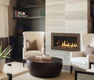
We knew we wanted a linear (read, long and skinny) fireplace. In general, linear fireplaces shouldn't sit on the floor. Ben and I are in "discussions" over how far off the floor it should sit, but we know that the fireplace will be raised similar to this one. Also, we don't want a mantle... although maybe a ledge so Santa can still find our stockings?
We want ambiance, not heat. Our living room is small so 20,000 BTUs should be more than plenty. Hold the logs, please. We'll also pass on those super shimmery pieces of glass that remind me of a (wannabe) cool outdoor bar scene from Miami Beach or Cancun. Just simple black rocks will do.
So putting all of this together, the fireplace decision is made. Drum roll, please: Heat and Glo Cosmo 32 (see picture above). It's sleek, simple and black with a 32" linear shape. And, best of all, it is actually affordable!
The design of the fireplace wall was a bit trickier. After much Houzz-ing (definition: viewing photos on Houzz.com), and much debate, Ben sketched a simple design that we both like:

There is a large window on the left. The fireplace will sit in the middle of the wall, off the floor. There will be a small ledge above the fireplace (maybe just 6" or so), but Ben has reminded me that it is "to give definition to the space" and not for knick-knacks (except during the holidays). The TV will be to the right, set back a bit.
We have decided that we do not want the TV to be the focus of the room. I'd really prefer not to have a TV in the room at all, but let's be honest, I have two kids under 4 years old, so Miss TV is a part-time babysitter (at least while I'm cooking dinner). And I do like to unwind in the evenings with some Jeffrey Lewis and Chelsea Handler, and a glass of wine. Oh, and I'm somewhat addicted to Fast 'N Loud.
You can see a bit of texture in Ben's sketch in the form of horizontal lines. These are wood panels and are inspired by this yellow wallpaper.
Yep, it's bright yellow. Although we won't be using this wallpaper, it is the inspiration behind our design. We're hoping to use actual wood to create a similar look on the fireplace pop-out. Not sure about bright yellow, but we haven't ruled it out! Yellow and gray with some pops of turquoise (definitely my favorite color right now) would look fantastic.
We want ambiance, not heat. Our living room is small so 20,000 BTUs should be more than plenty. Hold the logs, please. We'll also pass on those super shimmery pieces of glass that remind me of a (wannabe) cool outdoor bar scene from Miami Beach or Cancun. Just simple black rocks will do.
So putting all of this together, the fireplace decision is made. Drum roll, please: Heat and Glo Cosmo 32 (see picture above). It's sleek, simple and black with a 32" linear shape. And, best of all, it is actually affordable!
The design of the fireplace wall was a bit trickier. After much Houzz-ing (definition: viewing photos on Houzz.com), and much debate, Ben sketched a simple design that we both like:

There is a large window on the left. The fireplace will sit in the middle of the wall, off the floor. There will be a small ledge above the fireplace (maybe just 6" or so), but Ben has reminded me that it is "to give definition to the space" and not for knick-knacks (except during the holidays). The TV will be to the right, set back a bit.
We have decided that we do not want the TV to be the focus of the room. I'd really prefer not to have a TV in the room at all, but let's be honest, I have two kids under 4 years old, so Miss TV is a part-time babysitter (at least while I'm cooking dinner). And I do like to unwind in the evenings with some Jeffrey Lewis and Chelsea Handler, and a glass of wine. Oh, and I'm somewhat addicted to Fast 'N Loud.
You can see a bit of texture in Ben's sketch in the form of horizontal lines. These are wood panels and are inspired by this yellow wallpaper.
Yep, it's bright yellow. Although we won't be using this wallpaper, it is the inspiration behind our design. We're hoping to use actual wood to create a similar look on the fireplace pop-out. Not sure about bright yellow, but we haven't ruled it out! Yellow and gray with some pops of turquoise (definitely my favorite color right now) would look fantastic.
Saturday, October 12, 2013
Up, Up and Away
Yep, that's a second floor! This is a drive-by photo from a friend of mine. (Thanks, Liyah!) It was very exciting to see the new developments. We are able to see the scale of the house now that the 2nd story exterior walls are nearly complete.
The shape of the back of the house is also taking form. We've cantilevered out about 3-4' in order to gain a bit more floor space upstairs and so that we'd have a covered area for the BBQ.
We really wanted to avoid another "modern box house" so our architect came up with a few creative concepts and they are starting to take shape in the photo above:
(1) We decided to split our roof line and make it about 2' higher on one side. This also allows us to show off our funky, angular soffits. Love 'em or hate 'em, we promise that they will be unique. I really don't think we've seen another house in the neighborhood with this type of soffit. Our contractor tells me that they will take a long time to construct - but (hopefully) well worth the extra effort!
(2) The depth of the back of the house will be slightly greater on one side than the other, meaning that it will push further into the yard on one side (on the 2nd story).
(3) Also (slightly hard to see - and explain), the "belly band" raises up about a foot in the middle of the house.
The front entry of the home will look very different as well, but they won't start on the new entry until the roof is underway. Roofing package gets delivered next week!
Friday, October 11, 2013
Movin' on up!
Things are moving along! I drove by on Thursday and took this picture for Ben. It was the first time either of us had seen any framing for the 2nd floor. I sent him the photo by text...
His immediate response, "Someone tell that guy to put down his Coke and pick up a hammer."
Ha! It is official proof that Ben is way more observant than me.
Tuesday, October 8, 2013
Then and Now
1943
The Year the Home was Built
2007
The Year we Purchased the Home
2013
The Year we Started our Remodel
Stay tuned for...
2014: The Finished Project
2014: The Finished Project
Saturday, October 5, 2013
Progress
Here is a picture of the framing for the 2nd story addition (below). This is inside the living room. We intended to raise the ceiling from 7'6" to 8'3", but the demo team realized that our house "tipped" about 3" towards the street over the years. So, effectively, it was 3" shorter on the street side. In order to even everything out, they added another 3" to the living room side. Yay! Now our ceilings will be a foot taller. This 3" "tip" ended up to be a blessing in disguise.
Kitchen demo has begun... the 80s cabinets are gone! And so is that awful grayish-blue tile with gold flecks. Good news all around.
Bar Cantinetta
2 kids = we deserve a glass of wine
2 kids plus a large-scale remodel project = we deserve a bottle (or two) of good wine AND an amazing dinner. So...
Last night, Ben and I went on a well-deserved date night to Bar Cantinetta - one of Madison Park's newest "hot spot" restaurants (barcantinetta.com). We absolutely loved it - five stars all the way. It's now one of my favorite restaurants in the city. (No, I'll never cheat on you, St. Clouds... you'll always be my favorite. But last night I definitely had the best meal I've had in Seattle in a long time.) La Bete and Tanglewood Supreme were other recent top contenders, but gosh, Bar Cantinetta just blows them right out of the water.
Wine
We ordered the Stevens Cab Franc. A trusty favorite.
Food
We were seated at the kitchen bar and we watched executive chef, Emran Chowdhury, cook each and every dish. We'd see something that looked tasty and then we'd ask Emran to cook it up for us. Such a fun experience! Amazing that this guy, must be in his 20s, can cook such delicious food in a 10' long, 2-man kitchen.
All of the dishes were awesome... but we LOVED and salivated over the polenta with sopressata and poached egg. Seriously, I would have ordered 3 more of those.
Here is a picture of the menu blurb. The last sentence is simply awesome and so well suited for Madison Park, where everyone is just a bit "loftier" than in other parts of the city.
The restaurant is small - only 8 tables - but well worth the wait if you get in (no reservations). The perfect date night restaurant!
I just realized this post has NOTHING to do about the remodel. Ha! See, I knew I should have just written about food and wine. Hmmm...
Friday, October 4, 2013
Jonathan Adler: I love you!
Jonathan Adler: I love you. But why did you have to open a store in Seattle? (And why is your return policy so stinkin' crappy?)
2. Antlers and Hippos. Jonathan Adler has fantastic decor pieces. Sadly, it would be really hard for me to justify buying an $895 leather hippo. I have a voice inside my head saying, "that $895 should probably go into the college fund." Damn you, voice.
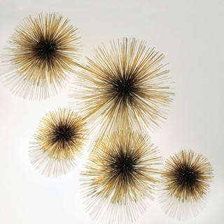
Not much I can say about urchins on a wall, except that this is Seattle and anything goes - and I think 3D art is really cool.
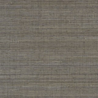
3. Grasscloth - We've had our eye on wallpaper for a long time. Grasscloth is easy to look at and can really warm a space. JA has some great ones. We're planning to go with something with a bit more pizzazz but I still love this gray one. It would be great in a master bedroom. Gray, gray, gray! I can't get enough of it. Yes, even in Seattle... love it.
I don't want a house that looks or feels like any other house in Seattle. That just seems boring. I want something unique and fun. And now that JA has a store about a mile from our house, I know his designs will be all over the 'hood.
I guess I'll have to limit my JA purchases for the home. Here are a few of my top contenders:
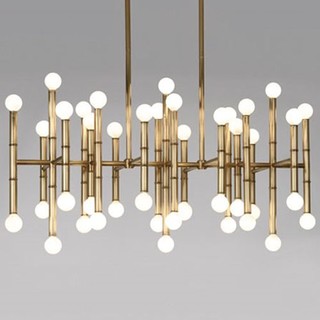
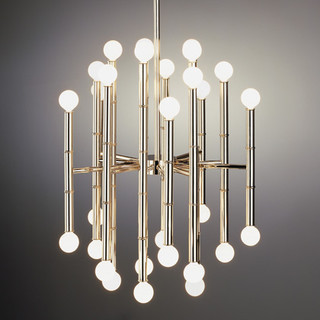
1. The Meurice Chandelier. I love it in every shape and size. Gotta go with the brass. Would it be annoying to worry about changing 42 light bulbs? Probably, since I barely have time to sweep my floors. But, a friend of mine (with excellent taste) said, "if that's a concern, you don't love the light enough to buy it." Hmm, interesting thought. I'll just have to add "change light bulbs" to my honey-do list (which I've now learned is totally okay to just leave over voice mail).
1. The Meurice Chandelier. I love it in every shape and size. Gotta go with the brass. Would it be annoying to worry about changing 42 light bulbs? Probably, since I barely have time to sweep my floors. But, a friend of mine (with excellent taste) said, "if that's a concern, you don't love the light enough to buy it." Hmm, interesting thought. I'll just have to add "change light bulbs" to my honey-do list (which I've now learned is totally okay to just leave over voice mail).
2. Antlers and Hippos. Jonathan Adler has fantastic decor pieces. Sadly, it would be really hard for me to justify buying an $895 leather hippo. I have a voice inside my head saying, "that $895 should probably go into the college fund." Damn you, voice.
Not much I can say about urchins on a wall, except that this is Seattle and anything goes - and I think 3D art is really cool.
3. Grasscloth - We've had our eye on wallpaper for a long time. Grasscloth is easy to look at and can really warm a space. JA has some great ones. We're planning to go with something with a bit more pizzazz but I still love this gray one. It would be great in a master bedroom. Gray, gray, gray! I can't get enough of it. Yes, even in Seattle... love it.
Subscribe to:
Comments (Atom)


.jpg)


